Welcome to My Blog!

Hi! Thanks for visiting! If you have a blog or other favorite website you'd like me to check out, let me know! And, please, comment on my posts--I'd like to hear from you.
--Ms. Molly


Monday, June 30, 2014

Margaritaville Casino Layout

There's a lot going on in this layout from a trip to Las Vegas with Jess & Neal in January 2012.  I think the clutter-filled layout fits with the over-stimulation of a Vegas casino setting.  The photo is from the craps table at the Margaritaville Casino inside the Flamingo Hotel.  Note that Tom, Jess, Neal, & I were the only people playing at the time, and I asked the craps table employees if I could take the picture.  One sure way (of a million different ways) to get in trouble in Vegas is to take photos at any gaming table or of any random gamblers, so always ask first.  We all walked away from this table winners, so it's a great memory and one of my favorite pictures from that trip.
 
 
I originally shared this layout in a post from a crop in 2013, but never really wrote about it.  Here's the in-progress photo from the crop.  It looks like I was pretty much finished:
 
Since it WAS the Margaritaville Casino (look at the craps table--instead of the "Come" line, there's a "Come Monday" line), I wanted the layout to be at least a little beachy, so I used B&T papers that combined to look beach-like: The outside grey wood B&T paper is from the "Dakota" pack (a rugged, cowboyish themed pack).  The inner mat that I tore up and really distressed is the Lagoon splattered B&T paper from CTMH's "Later Sk8r" pack (a male-themed skateboard pack).
 
Close-ups of the dimension, distressing, and embellishments: 
I made the paper rose by tearing the spiral, gluing it, then stomping it with my foot.  I handwrote "Margaritaville Casino."  The "7" is craps related, and the other bling and metals are all just to shine it up Vegas-style.
 A lot of the embellishments are retired (like the metal tabs on the upper left).  The dice are from one of those $1 wood stamps near the checkout at Michaels stores.  I stamped "craps" with a retired CTMH alphabet set.  On a couple places I tore out whole sections of the Lagoon paper then wet it down to really crumple it and distress it.
The picture above shows more distressing.  I added a few spots of dimensional adhesive here and there to make the papers come up from the background even more.  "Instant Memories" is from another retired CTMH stamp set.
I like the look of some of the CTMH bling overlapping right on to the photo for a more festive feel.  I added the flowers for the Margaritaville theme, but blinged up the centers Vegas-style.  The same dice stamp is used three times on the layout, but it doesn't look the same because I oriented it in different ways.
 
Here's another look at the completed layout:

Sunday, June 29, 2014

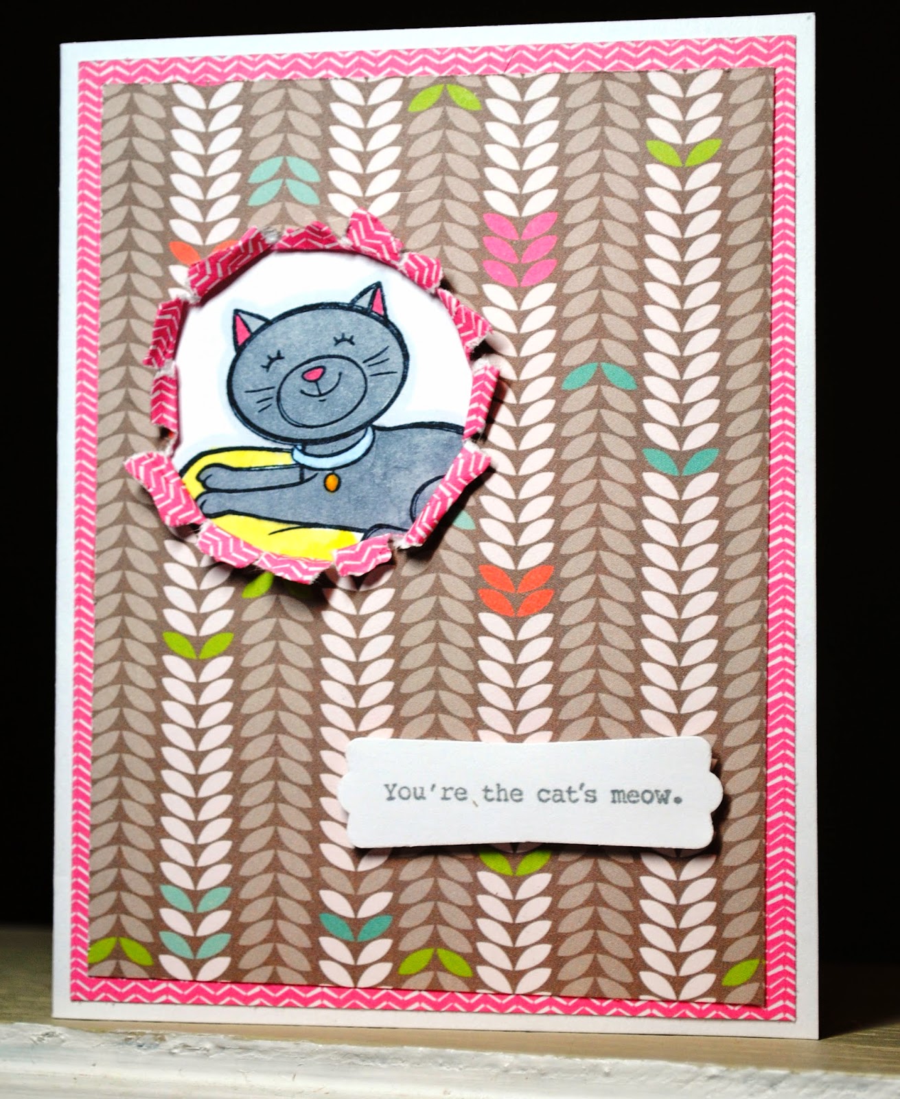
Cat's Meow Card

A card for the cat lover.  I used CTMH's "Cozy Cat" stamp set for the cat and the sentiment, and colored the cat with Copic markers.  The paper is from CTMH's "Lollydoodle" paper pack.
 
From the angle it's easier to see the sentiment is attached with dimensional adhesive.  The window for the cat was made by punching out a smaller circle, then tearing the paper around the whole and curling it back to make it appear cat-torn.
 
Here's another similar card, only with different papers and a larger window:
 
(I saw a card similar to this on Pinterest, but I couldn't find the original post, so I am unable to give the original artist credit.)

Sunday, June 22, 2014

Old Oars

The barn on my family farm had to be torn down recently because it became to unstable.  During its last days it looked like this:
 
 
Before it was too dangerous to go inside, my sister smartly scavenged a pair of old oars for me, which of course I wanted for our tropical-themed deck.
 
Unfortunately, I didn't get a "before" picture, but picture them looking a lot like the barn above.
 
After a coat of blue spray paint and sealer, we wound some rope around the handles and hung them on the sides of the entrance to our deck--a fitting welcome to our own Margaritaville.
 
 
Here's a close up of the left oar, showing just how worn it was on the paddle end:
 
The Tiki Bar is open!


Saturday, June 21, 2014

Flea Market Glass Toadstool

I saw this idea on Pinterest (of course).  To make these little glass toadstools or mushrooms, just use a cheap glass vase and a cheap glass bowl.  Turn the bowl upside down over the vase, glue with Super Glue, and you're done. 
They add a nice little sparkle to your flowers or landscaping.  Mine will eventually go into a flower bed, but for now it's on the deck.
 
Here's a closer look.  Any pattern on the glass works fine.  I bought mine for $1 at the What Cheer Flea Market here in Iowa this spring. 
 

Friday, June 20, 2014

Overserved Layout with Sarita

The last layout was photos of us lounging at the hotel.  We had to do that, because of our behavior at night on Bourbon Street filled with drinks, dancing, lots of laughs, and not enough food.  There's something about New Orleans that makes the drinks mighty tasty....
Anyway, this layout is simply titled "Overserved?"
 

I used CTMH's "Sarita" paper pack.  I chose to add some Ruby and Whisper cs, and not to use much of the blue, so it really has a different look.

 
Here's a close-up of the large cluster on the left:
I stamped the argyle diamonds from 7 Gypsies with ruby ink right on the background B&T paper to add some dimension.  "Overserved" is stamped in Ruby ink with the "You Are My Happy" alphabet stamp set and attached with dimensional adhesive so it's raised off the page.  I used CTMH black bling and gold Durables.  The three drinks are SU stamps from their "Cheers to You"
 set, which I colored with Copic markers.
 
The bottom right-hand corner: 
My picture of our table at Pat O'Brien's turned out pretty fuzzy, so I added the "Fuzzy Memories" subtitle to go with the whole "Overserved" theme.  "Fuzzy" is with the "You Are My Happy" alphabet again.  This set is great because it includes both the upper and lower case letters in one set.  "Memories" is cut from a long-retired stamp that said "Captured Memories," and I cut out just the word "Memories."  Both words are stamped in Ruby ink.
 
Before I get called out on it, I should probably note that the term "Overserved" is a joke, and I absolutely would never blame my server(s) for the amount of alcohol consumed.  I blame that solely on my friends. [wink]
 
And here's a look at the whole page again:
 
Good times.  This layout makes me smile and want to go back to NOLA.

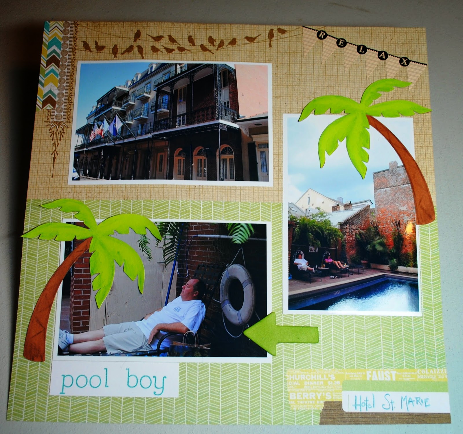
Hotel St. Marie Layout with Skylark

This simple layout is of the inside and courtyard at our hotel in New Orleans, the Hotel St. Marie (on Toulouse less than a block off Bourbon).

I used CTMH's paper pack Skylark to complement both the New Orleans style architecture of the outside of the hotel and the greenery in the courtyard by the pool.  I handwrote "Hotel St. Marie" in the space already provided on the B&T paper with a blue colored pencil.  "Pool boy" was stamped in CTMH Lagoon ink with the "You Are My Happy" alphabet stamp set.
The palm trees were cut with my Cricut using the CTMH Artbooking cartridge.  I used CTMH watercolor pencils to give the palms and trunks a little shading.
The banner at the upper right is from Idea-ology (?I think?).

Monday, June 16, 2014

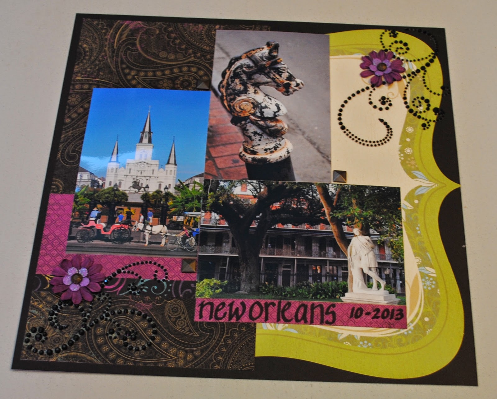
New Orleans Laughing Lola Layout

For this layout, I used CTMH's Laughing Lola paper packet and mixed in a die cut from the retired Miracle kit. 
 
My layout is loosely inspired by this sketch I found on Pinterest:
(sketch from scrapbook.com)
 
 
Back to my layout:
The jeweled flourishes, large paper flowers, gold flower centers, and square gold embellishments in the corners where the photos meet are all CTMH. The smaller lavender flowers are from Recollections.  I freehanded (obviously) the place and date with a black Copic marker on some of the B&T paper.

Sunday, June 15, 2014

Halloween in New Orleans Layout

Just under two months with no scrapbooking or card making posts?  I must be caught up with all my projects, right?  Yeahhhh, right.   Nevertheless, I'm back in the paper crafting mood, and here's a layout I made today:

 
If you've never been to New Orleans, GO!  If you've never been to New Orleans for Halloween, GO BACK!   There's a parade like only New Orleans can roll, tourists and locals dress up in great costumes, the French Quarter is decorated for the event, and the city is pretty spooky anyway with its history of voodoo and its old neighborhoods and architecture.  Plus, the crowds aren't as big as Mardi Gras, Blues Fest, or St. Patrick's Day.
 
Here's the left page:
 
I used a mixture of papers and embellishments from several different companies, so I won't list them all.   I even used stickers!--which I never use anymore.   I went with purple as my main color because it works for both Halloween and New Orleans.  The top two photos are from the Krewe of Boo parade, and the bottom one is from Bourbon Street.
 
   And, here's the right layout:
 
The center picture is St. Louis Cemetery No. 1 near the French Quarter and the others are a decorated balcony and shotgun home also in the Quarter.   I inked around both background cs pieces for an older, spookier look, and I used black to edge around all the photos as well.   All of the bats on the layout are raised with dimensional adhesive, and I've added lots of bling with Stickles and Liquid Pearls.