Welcome to My Blog!

Hi! Thanks for visiting! If you have a blog or other favorite website you'd like me to check out, let me know! And, please, comment on my posts--I'd like to hear from you.
--Ms. Molly


Showing posts with label New Orleans. Show all posts

Sunday, February 7, 2016

New Orleans Saints Layout

It's Super Bowl Sunday!

I'm not at the Super Bowl today--I'm somewhere much better in my opinion. But we did go to an NFL game while we were in New Orleans for Halloween, so in keeping with a football theme for the day, here's my layout from that game:


The game (New York Giants vs. New Orleans Saints in the Super Dome) was the third highest total points in NFL history, which made for a great time: lots of touchdown celebrations. My husband said both teams' defensive coordinators should be fired, but I didn't care. I like offense!  The Saints won 52-49 with a last second field goal, which was super-exciting. The fans were chanting "Who Dat!" long after the game. (If you don't get it, don't worry--it's a New Orleans thing.)
 
My layout was simple. I used black & gold (Saints colors) and white.  I had some large black tags sitting around, so I incorporated them into the layout. Here's the left side:
 
These pictures are during the pregame. We had great end zone seats!  I also used fleur de lis punches here and there to bring more of a New Orleans flair to the pages.  Here's the right page:
 
Most of my materials were CTMH, but I think they're all retired. I'll be sad when I've finally used up all the black striped B&T paper--it's been a favorite.  The top right photo is the winning field goal. The bottom pics show Drew Brees, the Saints quarterback, and Eli Manning, Giants quarterback and New Orleans native.  On top of a great game, we got to see two former Super Bowl winners.  Neither made it to today's game, although I'm sure Eli is watching his brother Peyton.
 
I used my "new" vintage typewriter for the journaling. I love that typewriter!
 
For the title, I used a CTMH alphabet stamp, punched out the letters, and affixed them with dimensional adhesive. This layout is pretty flat, aside from the title and the ties on the tags.
 
Thanks for looking, and I hope your team wins today!  I'll be watching beachside.


Saturday, February 6, 2016

Parrotheads in New Orleans

Parrotheads on the Road Again:

Twelve best friends plus Halloween in New Orleans equals fun plus lots of shenanigans!   The picture on this layout was from during the day while we were all behaving somewhat.  We always try to get at least one group photo. This one is from the river levy looking back toward Jackson Square and St. Louis Cathedral--a standard NOLA photo op spot. 
 
I used CTMH's Nevermore paper pack after creating the background with Dylusions black paint and brick stamp. I used lots of scribbling and doodling. The lettering is all handwritten/drawn.  The three fleur de lis are punches. 


In the background you can also see in three spots where I used a date stamp repeatedly and not particularly neatly:


It makes the background have more depth, plus adds the month and year of the trip. 

Monday, September 21, 2015

Halloween Layout / H2H "Doodle" Challenge

The last couple of years, I've really started liking Halloween--not in the cute ghosts or childlike trick or treat style, but the creepy, skulls & voodoo doll style Halloween.
 
We'll be in New Orleans again for Halloween, this time with our whole Parrothead gang, taking in all the entertainment, food, and libations connected with any time spent in the Crescent City, and I've already made a layout for a picture not yet taken.
 
 
I just finished the layout, then decided to check out what the H2H Challenge is for this week, and it happened to be "Doodling," so since I doodled on the edges of the layout corners, I thought "two birds/one stone" and went ahead and tacked it onto that challenge blog.
 
I started with a plain piece of CTMH black cs. I used Dylusions orange and white paint and stencils for the background.  Ever since I was fortunate to attend a few Dyan Reavely classes this summer, I've been obsessed with using her Dylusions line, so I thought it would make a great background for a creepy layout. I let the painted background dry for a couple days (I only needed 24 hours, but I just didn't get back to it before today).  I added the white "doodling" a/k/a scribbles on the upper right and lower left corners using a Uniball Signo broad gel pen.
 
The white mat started as a pristine 5" x 7" piece of CTMH white daisy cs, then I distressed it with black CTMH ink and drew some black scribbles/doodling in the corners (these are hard to see after I topped it with the orange B&T paper).  I also crinkled the corners to make them look well worn.
 
The orange B&T is a little bit smaller than 5" x 7" (I didn't measure).  I distressed it with brown ink and attached it at an angle.  (I think it might be paper from Little Yellow Bicycle, but I'm not sure--it was in my unorganized stash of Halloween papers.)
 
The ribbon is CTMH's black striped grosgrain, and I applied it with Scor-Tape.  I ran a long piece of tape on the layout, then twisted the ribbon as I put it down, so it's all messy.  I added some small pieces of tape here and there and folded the ribbon over onto itself to keep it in place. I purposely left the ribbon ends frayed.
 
 
The rose was made with CTMH's Art Philosophy Cricut cartridge. It was very pretty, then I smashed it flat and even tore it a bit and distressed it with black ink.  The tulle is also from CTMH. The three misc. brads and two stick pins are old CTMH embellishments from my stash that are happy to finally have a home, I'm sure.
 
 
The metal embellishment is from Tim Holtz, and the "Scary" insert is a sticker from Little Yellow Tricycle.
 
Here's the finished layout again:
 
Now I just need an awesome photo from the French Quarter on Halloween, and it's done! I'm sure I'll post it again once I do have that perfect picture.

Friday, June 20, 2014

Overserved Layout with Sarita

The last layout was photos of us lounging at the hotel.  We had to do that, because of our behavior at night on Bourbon Street filled with drinks, dancing, lots of laughs, and not enough food.  There's something about New Orleans that makes the drinks mighty tasty....
Anyway, this layout is simply titled "Overserved?"
 

I used CTMH's "Sarita" paper pack.  I chose to add some Ruby and Whisper cs, and not to use much of the blue, so it really has a different look.

 
Here's a close-up of the large cluster on the left:
I stamped the argyle diamonds from 7 Gypsies with ruby ink right on the background B&T paper to add some dimension.  "Overserved" is stamped in Ruby ink with the "You Are My Happy" alphabet stamp set and attached with dimensional adhesive so it's raised off the page.  I used CTMH black bling and gold Durables.  The three drinks are SU stamps from their "Cheers to You"
 set, which I colored with Copic markers.
 
The bottom right-hand corner: 
My picture of our table at Pat O'Brien's turned out pretty fuzzy, so I added the "Fuzzy Memories" subtitle to go with the whole "Overserved" theme.  "Fuzzy" is with the "You Are My Happy" alphabet again.  This set is great because it includes both the upper and lower case letters in one set.  "Memories" is cut from a long-retired stamp that said "Captured Memories," and I cut out just the word "Memories."  Both words are stamped in Ruby ink.
 
Before I get called out on it, I should probably note that the term "Overserved" is a joke, and I absolutely would never blame my server(s) for the amount of alcohol consumed.  I blame that solely on my friends. [wink]
 
And here's a look at the whole page again:
 
Good times.  This layout makes me smile and want to go back to NOLA.

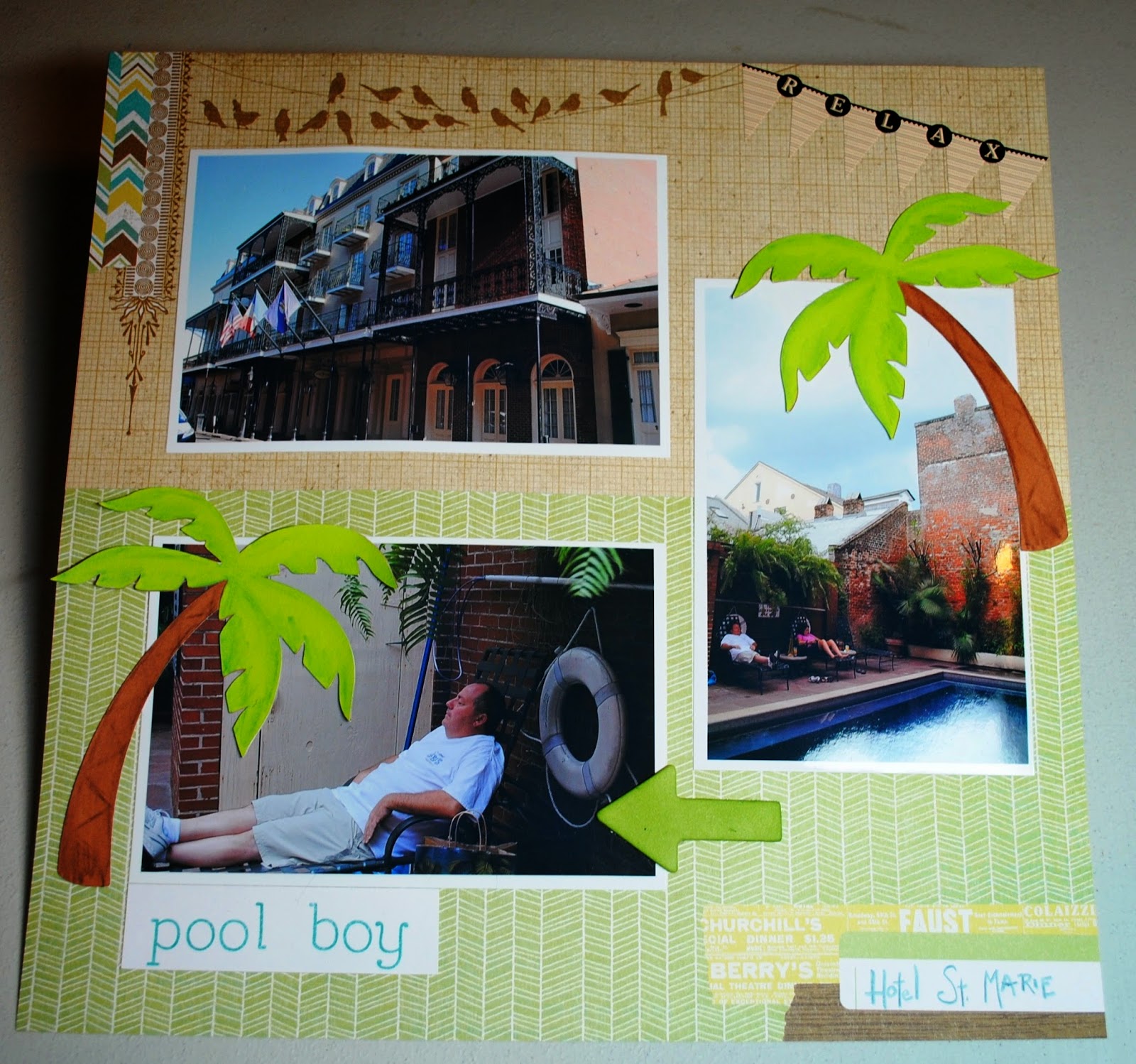
Hotel St. Marie Layout with Skylark

This simple layout is of the inside and courtyard at our hotel in New Orleans, the Hotel St. Marie (on Toulouse less than a block off Bourbon).

I used CTMH's paper pack Skylark to complement both the New Orleans style architecture of the outside of the hotel and the greenery in the courtyard by the pool.  I handwrote "Hotel St. Marie" in the space already provided on the B&T paper with a blue colored pencil.  "Pool boy" was stamped in CTMH Lagoon ink with the "You Are My Happy" alphabet stamp set.
The palm trees were cut with my Cricut using the CTMH Artbooking cartridge.  I used CTMH watercolor pencils to give the palms and trunks a little shading.
The banner at the upper right is from Idea-ology (?I think?).

Monday, June 16, 2014

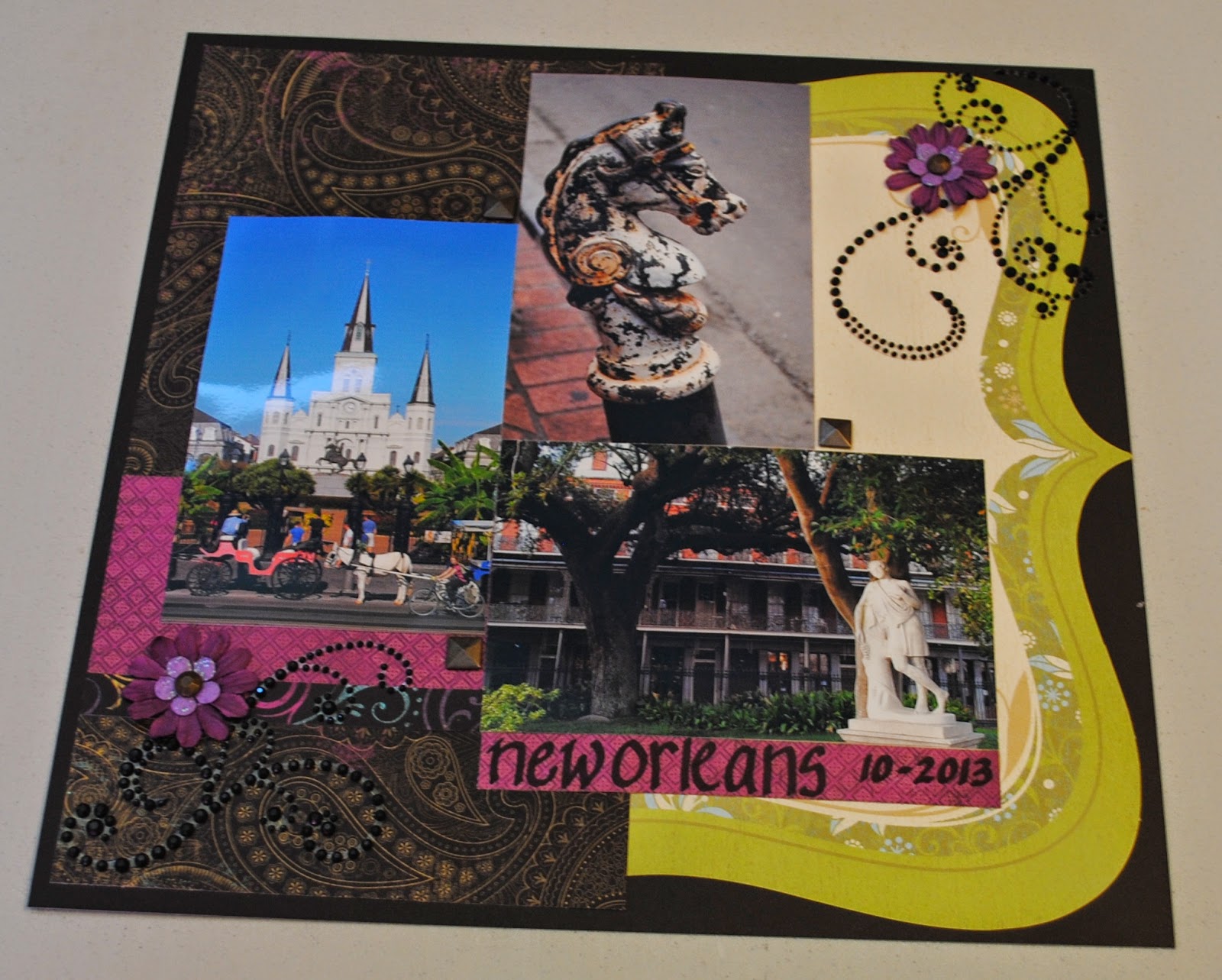
New Orleans Laughing Lola Layout

For this layout, I used CTMH's Laughing Lola paper packet and mixed in a die cut from the retired Miracle kit. 
 
My layout is loosely inspired by this sketch I found on Pinterest:
(sketch from scrapbook.com)
 
 
Back to my layout:
The jeweled flourishes, large paper flowers, gold flower centers, and square gold embellishments in the corners where the photos meet are all CTMH. The smaller lavender flowers are from Recollections.  I freehanded (obviously) the place and date with a black Copic marker on some of the B&T paper.

Sunday, June 15, 2014

Halloween in New Orleans Layout

Just under two months with no scrapbooking or card making posts?  I must be caught up with all my projects, right?  Yeahhhh, right.   Nevertheless, I'm back in the paper crafting mood, and here's a layout I made today:

 
If you've never been to New Orleans, GO!  If you've never been to New Orleans for Halloween, GO BACK!   There's a parade like only New Orleans can roll, tourists and locals dress up in great costumes, the French Quarter is decorated for the event, and the city is pretty spooky anyway with its history of voodoo and its old neighborhoods and architecture.  Plus, the crowds aren't as big as Mardi Gras, Blues Fest, or St. Patrick's Day.
 
Here's the left page:
 
I used a mixture of papers and embellishments from several different companies, so I won't list them all.   I even used stickers!--which I never use anymore.   I went with purple as my main color because it works for both Halloween and New Orleans.  The top two photos are from the Krewe of Boo parade, and the bottom one is from Bourbon Street.
 
   And, here's the right layout:
 
The center picture is St. Louis Cemetery No. 1 near the French Quarter and the others are a decorated balcony and shotgun home also in the Quarter.   I inked around both background cs pieces for an older, spookier look, and I used black to edge around all the photos as well.   All of the bats on the layout are raised with dimensional adhesive, and I've added lots of bling with Stickles and Liquid Pearls.

Wednesday, November 13, 2013

Where Have I Been?

I haven't had time for much crafting lately.  I've been traveling!  First, at the end of October, we went to New Orleans: 
Tom and I hanging out with the Who Dat?! Nation in Championship Square in front of the Superdome before we watched the New Orleans Saints beat the Buffalo Bills.

One of the floats we saw in the Krewe of Boo parade.  Halloween is a big deal in the Big Easy--lots of celebrating and costumes.

French Quarter architecture and colors.
 
St. Louis Cathedral from Jackson Square.

A cool sign with Iowa ties AND my name we saw at Molly's at the Market pub in the Quarter. 

 
And then after a few days at home in Iowa, last week we went to Seattle for our daughter's birthday:
 
Tom and I at Volunteer Park in Seattle.
 
Neal and Jess at Fremont Peak Point Park.
Me with Jess (the birthday girl) at Volunteer Park.
Now I'm home for three full days, and then it's a girls' weekend trip to Galena, Illinois.  Seems like my trips have me going to colder and colder destinations.
 
Lots of scrapbooking in my future!


Tuesday, March 26, 2013

Configurations Vacation Book

I thought I'd surprise my friend Teresa on her birthday with a scrapbook/shadow box from our road trip to the Gulf Coast last year.  Her birthday was a month ago, so it really is going to be a surprise.  Anyway, here's the end result:
Most everything is either from CTMH or Tim Holtz.  My basic idea came from the book Tim Holtz showed during the CHA show this winter.  The newspaper-like tape on all edges is Tim Holtz.  The papers are all CTMH:  mostly the "Surf's Up" paper pack with a little bit of "Dakota" (the worn boards paper).  All the stamps are CTMH.

This is a view of the inside of the box.  I like that it's a shadow box so you can add shells, matchbooks, and other 3D objects, but it still has a cover, so if we don't want to display it, it slides onto a book shelf nicely.
Here's what the Configurations Book looks like when you get it--naked.  You can move the boxes around in any order you want or remove some, but I liked the original pattern.  Next I covered the edges of every box with Tim Holtz tissue tape:
And all the other edges of the Configurations Book:
Next, I covered the flat surfaces with patterned paper.
Cut the paper just short of the length/width of the book, so the tape shows around the edges.  I also distressed all the edges of every piece of paper.  I added ribbon around the book for a bow closure.  I glued it under the paper on the cover and on top of the papers on the back and spine.
The back of the book with the ribbon on the outside.
The ribbon on the spine of the book.
I used different coordinating patterns for the backgrounds of the boxes.  I glued the three shells on their respective boxes with CTMH Liquid Glass.  There's also a matchbook and a bit of letterhead from hotel stationery.
Here are all the photos added.  I also included some CTMH embellishments from the Surf's Up pack.  The large box on the right is for a mini book.
I made sure the cover was flat, because I want it to fit on a bookcase without being damaged.  The pennants are a SU punch, but I used CTMH paper.  The baker's twine is glued behind the pennants, but they hang free at the ends.  The words & numbers are all CTMH stamps.
This is the little mini book inside the cover.  I made the "door handle" out of a square button and a bead, which I affixed with Liquid Glass.  I was careful that the door handle landed in the center of a box on the right side, so the book would still close.  I made the book with several pieces of cs, scored down the left side and stacked and glued down the left side.
I added pictures from each day of the trip on the inside, along with some coordinating stamping, and computer-printed journaling.  I couldn't help but add a picture of me & Tom with a note that we are some of the "most awesome friends ever."
I included pictures of some of the favorite food and drinks from the trip to give a complete feel of the vacation.  You can see the embellishments at the top of the inside cover, which fit inside a box to the right when the cover is closed.
 
I like to use white colored pencil to highlight stamping on darker papers.
 
 
 Here's the mini book on the right side.  Again, it's just a few pieces of cs scored and taped together along the top.  The embellishments and stamps are CTMH.
Two holes in the top of the book make it slip right over these hooks.  I can't remember their exact name, but they're Tim Holtz Ideaology pieces.
I didn't permanently secure the book, so it still slides off the hooks in case my friend wants to do some of her own journaling in here.
And the inside of this book.  Plain, but I thought I need to leave her some journaling areas too. 
 
 
(I can't get over Mark eating those raw oysters--Yuck!)
 
Here's some more pics of the finished project: 

I didn't glue down the individual boxes.  You could, but they stay in pretty well by themselves.
You can see in this photo that all my tape isn't sticking down perfectly.  That doesn't really bother me.  I like the look with the wrinkles and loose bits.  It could be remedied with some white glue or more careful taping technique, if the messier look isn't your style.
 
It did take some time, but this was a really fun project, and I plan to do more.