Welcome to My Blog!

Hi! Thanks for visiting! If you have a blog or other favorite website you'd like me to check out, let me know! And, please, comment on my posts--I'd like to hear from you.
--Ms. Molly


Showing posts with label vacation. Show all posts

Thursday, September 3, 2020

Animal Kingdom

 Photo Op in The Boneyard


This is a super simple one-page, one-photo layout from Dinoland USA's Boneyard in Animal Kingdom. The pictures of both kids together postng were kind of rare, and this is one of my favorites.  The background paper and the "Discover" sticker were leftovers from a long-ago Disney World vacation. I added the accounting worksheet paper, used Thickers for the title, and hand wrote the journaling. The paper was kind of bright, so adding the worksheet really made the layout match the photo better.

Hakuna Matata,
--Ms. Molly


Saturday, August 8, 2020

Expedition Everest

 Back to Disney World:

We didn't have any pictures from Expedition Everest except Jess & Neal's Disney ride photo. That made for a good one-picture layout opportunity, where you can get more creative.

The papers are VERY old from my stash, and I tucked some antique looking ephemera around the edges because it is an "expedition."

I really like how the mountains are outlined with the white cardstock.  I got this idea from this layout from Kim Ege on SweetShoppeDesigns.com, which I saw on Pinterest and knew right away I would use the idea for this photo. 

Cheers!
--Ms. Molly


Sunday, March 17, 2019

Shae by the Sea

12 x 12 Scrapbook Layout


Sweet Shae loved her first beach trip, even if the waves were a little overwhelming. This layout of Shae at the Gulf Coast is simple, but I wanted to focus mostly on the pictures and her expressions. All the papers are from the line "Summer Splash" by Carta Bella, as well as several of the embellishments including the "Beachy" sign. I absolutely love Summer Splash, and have created several beach layouts using it.

To add a little more interest, I added the white to the background paper to look like waves breaking, using Tim Holtz's Distress Crayon "picket fence."

The starfish is from Jolee's Boutique from my large stash of everything beachy.

I added lines of Nuvo Drop dots above and below the main strip and randomly within the starfish paper print.

I LOVE this picture:

Thanks for stopping by! More beach layouts are on the way......


Tuesday, January 29, 2019

Easy Hawaii Layout

Paradise Found

In my quest to try to update my scrapbooks, I'm jumping around and just making pages of anything I want. The other day I felt like using beach paper, and I ended up with this layout for our Ohau trip three years ago.

The pictures are from various sites around the island. I used a paperpad called "Utopia" from Authentique for the papers. I used four: the op half of the layout, the bottom half, the strip through the middle, and the punched flowers.

I added Nuvo drops to the flowers I made, and to the centers of the flowers already on the paper in the bottom right. I used my own handwriting for the journaling.

Thanks for taking your time to look at my layout. Hopefully, lots more to come this year!

Thursday, September 7, 2017

Family Vacation Layout No, 4: The Arcade

Wisconsin Dells

This is the fourth in a series of layouts, to see the first three click on one of these links: Layout One; Layout Two; or Layout Three.


I don't know how many arcades our resort had, but we definitely hit all the big ones. Finn loved that he could play some of the games, and all the lights and machines were very exciting for him. And since we're all kids at heart, we all got into the spirit and played along too. Who doesn't enjoy skee ball or a good crane game where you win a ball the size of a beach ball?
 
Here's my layout for the arcade:

As you can tell, I wanted it to reflect the super busy, overstimulating atmosphere of the arcade.
Here's the left page up close:
 
 
The papers for these pages are all, I'm pretty sure, discontinued.  All from CTMH, they are from most recent to oldest, Adventure "Fundamentals," "Confetti Wishes," and "Hooligans." I was so happy to find a use for the old "Hooligans" paper that actually has a video game theme!
I stamped the title banner with one of my all-time favorite alphabets: CTMH's "Pennant Alphabet." It wasn't shiny enough alone, so I added Ranger's Glossy Accents.
 
 The embellishments are an assortment of CTMH and other stuff from my stash, none of it new. This was a great layout to use up some old items. Here's a close-up of some of them, along with that "Hooligan" video game paper. The little white words on black backgrounds are from Tim Holtz's Ideology collection "Big Chat."--probably the only current product on the layout!
 
 
Here's a closer look at the right layout.
 
 
It's more busy-ness in paper and embellishments. The "Be Happy love life" are cut from a B&T paper in the Fundamentals "Adventure" pack. 
 
 
 You can kind of see in this close-up that I used Rangers Glossy Accents again over the letters to give them a shine. And here's a last look at the whole layout:


A great vacation! I can't believe I've already finished the scrapbook pages for it. That's definitely something I haven't been very good at keeping up on in the last several years.
 
 I'm ready for another one! Next up, the Parrotheads go to Pensacola for a long weekend, and I'm ready! Will it get scrapbooked in a timely manner? Probably not, but It's good t have goals. 


Tuesday, September 5, 2017

Family Vacation Layout No. 3

Wisconsin Dells

This is the third in a series of layouts, to see the first two click on one of these links: Layout One or  Layout Two.


The Dells are all about waterparks. Our resort alone had something like three outdoor waterparks and three indoor waterparks, including huge slides, wave pools, and anything else you can think of. 
We spent much of our time in the kiddie areas with the grandkids.  Here's the layout memorializing those times:


I really like this two-page spread. The papers are from CTMH's "No Worries"
Workshops Your Way. The pink and yellow cs are also CTMH. The left page is devoted to Shae, our water baby, and the second to Finn the wild child.

 
On Shae's side, I matched the cs with the pink in her super-cute sun wear. She hadn't been sitting up alone for long, and it was adorable seeing her sit up by herself in a couple inches of water.
The "Brave & Strong" sticker was from the CTMH "Jack" Workshops Your Way stickers.
The button on the top is from Dear Lizzy.  I added doodling around the striped piece and silver Stickles dots to match the title.  Here's a close-up:
 
 
When I start to run out of a set of letters, I like to mix them together, and that came together well here. The letters were from three old sets. The net is from a CTMH stamp, and I doodled the white splashes with a white pen.


Finn's side used yellow cs to match the waterslide and the yellow in his trunks. He had an absolute ball going doing the slides and playing in the water.  The title letters are from the "Jack" CTMH Workshops Your Way.


"Together under the Sun" is from CTMH's "No Worries."  I used up a bunch of aqua Dots from CTMH around the sticker and at the top right to resemble water. Again, I doodled the splash above the title to make it coordinate with the other page.


The bright, fun look of this simple two-page layout really captures the joy the kids had in the water. The two pages use a lot of different colors and elements, but they have enough like components that they really compliment each other. Here's a look at the whole layout again:


Friday, September 1, 2017

Family Vacation Layout

Wisconsin Dells

I actually finished the layouts for our family vacation to the Wisconsin Dells. This is the second year in a row we've driven to the Dells, and I think last year's trip has maybe one layout done, so don't be too impressed.  My last post was also a Wisconsin Dells vacation page, but it was solely for Shae's baby book because it was her first vacation. (Poor Shae--her baby book is so empty. That's also on my to-do list: more layouts for Shae's book.)

Here's the first layout for the trip. I like to start like sections of layouts with a one-page layout, kind of a title page for either the whole scrapbook if it's a large number of layouts or if it's a section of layouts within a book of various layouts, then it signals the beginning of a new section.

 
The Dells is approximately 5 hours away from where we live in Iowa, so we road trip there. I know not everyone does, but I love a road trip. We always have some great laughs and memories from the road. The top left photo is a selfie of us in our rented minivan. Shae isn't visible because she's in a rear-facing car seat in the way back. The other pics are Shae in her "Vacay All Day" shirt and Finn in his vacation shirt that we bought him in Hawaii last year. His quote (on the page) cracks me up: "This is my vacation shirt. It's really orange."
 
Everything but the title is from CTMH's "|Jack" workshop on the go. It includes coordinated papers and embellishments.  The title is a die cut I picked up at my LSS, Memory Bound in Ankeny, Iowa.  I wrote the dates of the vacation with a white uni-ball pen.

Sunday, July 30, 2017

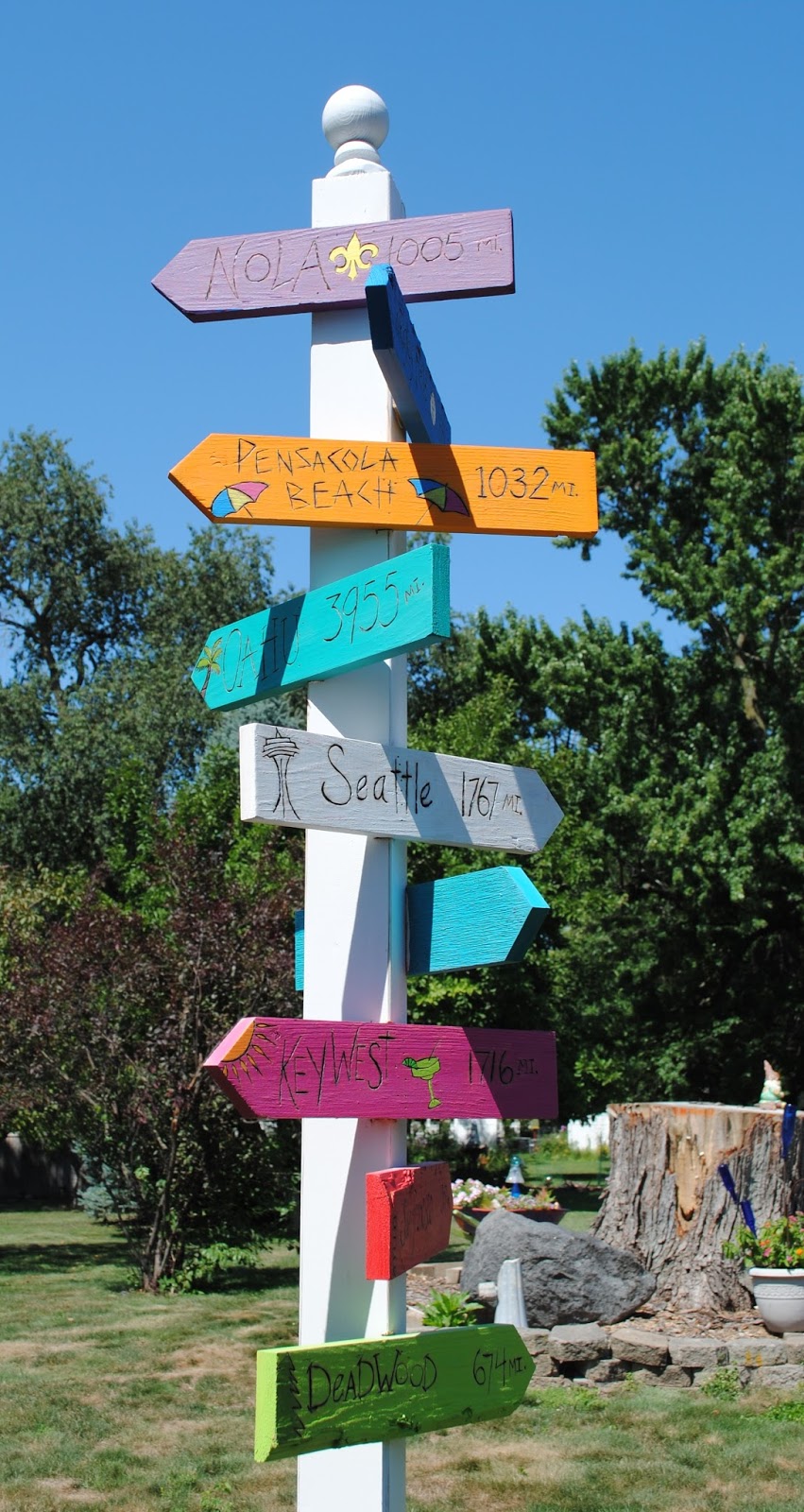
Vacation Sign Post

After 2+ Years, It's Finally Finished (kinda)


This sign post took over two years to complete (mostly because I'm easily distracted). I chose some of our best travel destinations, whether as a couple, with our family, or with good friends. It has room to add more, so I'd like to say it will never be completely finished--at least I hope I have lots of travel adventures yet to come!

Here's some more shots of it closer and from different angles:


My husband Tom cut the individual signs for me. Something I should be able to do myself, being a feminist and all, but he knows what he's doing, so why not let the professional do it, right?
 
Then I sketched letters and pictures on each sign. I tried to use a different lettering style on almost all of the places, and I didn't try to do them straight. I find if I intentionally make things crooked, it looks better than trying to do it perfect and not getting it that way.
 
I used my pencil letters just as a guide, as shown here. Then after I was done, I went back and erased the lines. If I couldn't come up with an appropriate picture for a sign, I looked at simple clip art photos for ideas. (Clip art was very helpful for a simple representation of the Seattle Space Needle.)
 
The distances I used were what Google Maps told me was the distance from each spot to my house.  I still need to make several more: Las Vegas, Wisconsin Dells, and Disney World. 
Here's a work-in-progress pic:
I used Dylusions paints exclusively on the signs, because they all match each other well, and I love the bright colors. I'm also a huge Dyan Reaveley fan (if you've read my previous posts, you know this already).
The post is from the local home improvement store. We added a finial, and spray painted it all white. I distressed the edges a little bit with sanding, but you can't see it on any of the pictures.
This post brace is what holds it in place. It looks a lot like those beach drink holders before you hammer it into the ground. or maybe the beach drink holders look like this thing.  I'll do better landscaping around it later.
More help from the professional: Tom glued and nailed each sign up so they're super secure. He noted out corners of the post where the signs needed to be put up at an angle, which was most of them. This way there was more flat area to glue/nail them to.  Here's a pic of him in action cutting a notch for the Seattle sign:
 
Once it was up, the whole thing was weather sealed very well. I'm not sure what kind of sealer we used, but it was in a spray can.
Another picture of the signs and post all put up.  Now I just need to go on some more vacations so I can add more signs! Here's the view I enjoy from our backyard deck: 


I love how it turned out. If you would like to make your own and have questions, just drop me a comment, and I'll get back to you. Because this took so long, I'm taking exactly zero orders, so copying this idea doesn't bother me in the least. But if you do copy, please give me and/or this blog a shout out for the idea.


Tuesday, January 17, 2017

Wisconsin Dells Layout

Catching Up on Some Scrapbook Pages

Another post! This is becoming a habit!  This layout is from our trip last summer, Finn's first vacation with our family, to the Wisconsin Dells.

 
What started out as a single page layout (the left side), evolved into a two-page spread because I simply couldn't fit the "Wisconsin" and "Dells" banners on to the one page without scrunching them up too much. It works okay as a two-page layout, but I can definitely tell it was a mid-design change. Hopefully, it worked out.
 
\
The first page (all products on both pages are CTMH) highlights a paid-for photo from the boat cruise we took. We bought the photo because it was laughable of all of us--we're weird that way. Especially funny was how poor little Finn had to just peek out between the fake rails. He's not looking very happy, and that turned out to be a theme for the whole cruise. There were many tearful incidents, and before it was over, he sat right in some nacho cheese. It was a memorable excursion.
 
 
This page shows how good Finn was for the trip to The Dells (about a five-hour car ride). Wearing his vacation shirt we bought him in Hawaii, he looked like his grandpa before a Jimmy Buffett road trip as he helped pull the cooler to the car. He posed for a picture before getting buckled in, and in the top right-hand photo he couldn't have been better behaved when we stopped for lunch. For most of the long weekend he was SO good. More layouts to follow I hope!

Sunday, August 4, 2013

Where Have I Been?!

Yikes, this blog is stagnating this summer.  Mostly because I've been busy, busy with work, my daughter & son-in-law's college graduation, storing a lot of their stuff in my studio, and finally a week-long road-trip to Seattle to see them and take the aforementioned stuff to their new apartment.
 
Here are some just-waiting-to-be-scrapbooked photos from Seattle:

Cub fans in Seattle!
 
The Fremont Troll

Tom & I at the Space Needle

Jess at the beach -- I always love unstaged photos of people walking on beaches.

Jess & Neal at the International Fountain

In front of their apartment building
Flowers at Pike Place Market -- Beautiful!
 
Tom and I in front of the skyline


I even did a little scrapbooking on my lap in the car -- more on this later!
 

Wednesday, June 20, 2012

Junk Album - Part 4 (finished!)

This is Part 4 and the final post of my Junk Album.  It always feels great to complete a project that has been in the works for a few months!  Part 1 can be found HERE.  Part 2 is HERE, and click HERE for Part 3.

 I used some of CTMH's Dotty for You papers for the Orange Beach pages.  These pages are of our hotel in Orange Beach and, of course, the beach.

Yep, more Parrothead stuff.  We went to Jimmy Buffett's sister's restaurant and bar--Lulu's.
I bought some small merchandise in the giftshop there and kept the sack, punched holes in it, and it fits perfectly in the album.  I don't think I've ever mentioned that my largest album pages and the covers are 11" x 7.5".  The odd dimensions adds too the "junky" look I think.

I stuck random stuff I couldn't/didn't want to scrapbook into the bag:  more beads, hotel notepad, a matchbook, and a lanyard.  It's a great place to stash the extras that usually end up filling a junk drawer.

I glued a postcard I bought at Lulu's on the back of the sack.  Postcards are great additions to scrapbooks, especially photos of arial views you can't get yourself.  I did a little stamping on the bag too.  The right side has more pics from Lulu's.  (How cool is it that my drink came with a silly straw?)

The last pages of the Orange Beach area are from the beach before a storm.  I loved the changing colors and shapes of the clouds.

I went back to CTMH's Cruisin' papers and stickers for the last pages, which incorporate a few miscellaneous pictures from the road trip.  Teresa celebrated her birthday on our last night out.  I'm not sure if you can read the journaling on the lower left of the picture, but this is definitely the first time I've used the word "sodomizing" on a scrapbook page!


Here's a look at just how thick and junky the finished album is:


And a last look at the cover again:


Thanks for looking at this and all my other creations!