Welcome to My Blog!

Hi! Thanks for visiting! If you have a blog or other favorite website you'd like me to check out, let me know! And, please, comment on my posts--I'd like to hear from you.
--Ms. Molly


Showing posts with label beach. Show all posts

Thursday, August 6, 2020

Honey Bee Stamps Beach Cards

A break from Disney!


I needed a couple birthday cards, and no surprise, I wanted a beach theme for both. I recently ordered Honey Bee Stamps' "Flippin Fabulous" stamp set and matching dies, along with their "Beach Vibes" 6x6 paper stack.
The stamps and dies are great quality. I've never bought Honey Bee Stamps products before, but I definitely will again. 

I made this card for my friend using the stamps, dies, & paper. I used blue glitter embossing powder for the sentiment and raised it with dimensional adhesive. I spread Nuvo glitter drops (blue lagoon) on the sandal straps. I also added some little shiny star and circle sequins.
The second card needed to be masculine. I just changed up the colors of the sandals (I paper-pieced these), and added some brown strips under the sentiments, which I stamped in plain black. The paper is another from the same Honey Bee stack but more subtle.  I distressed all the edges with brown ink. Just those few changes made this card much for masculine, although I think both cards could be for either a female or male recipient.
Tip: The sandals come as one stamp, but I cut them apart so I could position them however I want. The dies are already separated.
Thanks for looking at my cards, and give Honey Bee Stamps products a try!

Cheers,
Ms. Molly

Wednesday, March 27, 2019

You Can Never Have Too Much Beach Time

Another Carta Bella Beach Layout


I love this layout of my grandkids in the Gulf of Mexico. Neither one was very fond of getting much more than their feet wet after they felt the tug of the waves, but they sure enjoyed the beach time.

This layout uses the Carta Bella "Summer Splash" collection, and I added the Recollections flowers, Nuvo Drops, and a starfish from Jolee's Boutique. The background paper is from Bazzill.

I can't say enough about how much I love the Summer Splash Line. My last four layouts were made with it.  Click back to my last three posts to view the other layouts.

Sunday, March 24, 2019

Family Beach Layout

My daughter's family at the beach

This layout is of my daughter Jess's family at the Gulf Coast last fall. This was Finn & Shae's first trip to a beach, and it was a success, despite Hurricane Gordon coming on land while we were there.


As I did on my other recent layouts, I used Carta Bella's "Summer Splash" collection for the papers and a lot of the embellishments. The background cardstock is from Bazzill, which makes great, sturdy papers for scrapping or cardmaking.

I added the little flowers from Recollections, the tag, sequins from CTMH, and the Nuvo Drops.

Thanks for looking!

Thursday, March 21, 2019

Fin[n]s Up!

Finn's Beach Layout

Finn enjoyed the beach as much or, because he's older, maybe even more than Shae. He was all smiles for his time at the Gulf.


There's a little glare on the photo of the left, but in person this layout looks great. I copied the basic pattern from the book Time to Scrap by Kathy Fesmire. It encourages the creator to use shape to create motion

The yellow background cardstock is from Bazzill. All the other papers and embellishments are from Carta Bella's "Summer Splash" collection, except the strings and the tag base. I also used Nuvo drops along the top edge of the photos for extra detail and texture. Both the tag and the upper beach ball are raised with dimensional adhesive.

(The title of this page "Fin[n]'s Up" is a play on the parrothead  phrase "Fins Up" referring to Jimmy Buffett's song Fins.  Parrothead jokes--only a few would understand, but I couldn't help it.)


Sunday, March 17, 2019

Shae by the Sea

12 x 12 Scrapbook Layout


Sweet Shae loved her first beach trip, even if the waves were a little overwhelming. This layout of Shae at the Gulf Coast is simple, but I wanted to focus mostly on the pictures and her expressions. All the papers are from the line "Summer Splash" by Carta Bella, as well as several of the embellishments including the "Beachy" sign. I absolutely love Summer Splash, and have created several beach layouts using it.

To add a little more interest, I added the white to the background paper to look like waves breaking, using Tim Holtz's Distress Crayon "picket fence."

The starfish is from Jolee's Boutique from my large stash of everything beachy.

I added lines of Nuvo Drop dots above and below the main strip and randomly within the starfish paper print.

I LOVE this picture:

Thanks for stopping by! More beach layouts are on the way......


Tuesday, February 19, 2019

Art Impressions Beach Card

"I Smell Old People."


I am very happy with how this beachy card turned out. I've been practicing my beach (sky, water, & sand) backgrounds with Ranger Distress Oxide Inks. I added some Glossy Accents to the water to look like waves and the water's edge (both look white in this picture). The very front of the sand is made with Flower Soft. It may be the first time I've used Flower Soft in the years and years I've had it. I don't know if it's even on the market anymore, but I thought it looked like dry sand.

The stamps are from Art Impressions. I'm not sure of the actual stamp names because I've thrown away the packaging, which isn't like me. I'm guessing they are older because I keep the packaging now. I colored the stamps with Copics and added little touches with Nuvo drops here and there.

 "I smell old people. Oh wait, that's you." is from the Tim Holtz Ideology Snarky Small Talk set.

The mat around the scene is a paper from the BoBunny 6x6 Beach Therapy Collection papers.

As long as the recipient has a sense of humor, I think this card would be appropriate for a birthday, retirement, or anniversary.

Monday, January 21, 2019

Beach Vacation Junk Journal

Memories and more Memories

We rented a van and took Jess and Neal and the grand kids to the Gulf Coast early last fall. We had an old-fashioned family road trip with messes, crying, car games, naps, good food, bad food, hotels, fights, beach days, shopping, walks (runs in the rain), sightseeing, laughs, smiles, and lots and lots of memories. Oh, and a hurricane named Gordon that took away some beach time, but gave us a couple fire alarms and quite an adventure.

I made this junk journal before, during, and after our trip. I just finished it today (the day I wrote this, not the day I posted it). It might get some more doodling added, but it could be done, so I'm classifying it as a "done" project.  Here are a few pictures of the finished book.

Look how thick and chunky this journal is!!! I love a chunky journal. I used the small Dylusions journal and the outside is made with Tim Holtz's Distress Oxide inks, splattered with water.  
I also love, love, love when ribbons an tags, an other "stuff" sticks out from the edges of  the journal. I added lots of ribbons and tags that would go behind the confines of the book. There's a sand castle charm, and the light blue rubber thing is the bracelet from a hotel we were supposed to wear to use the hotel's amenities.

I'm only sharing a few pages, but this is truly a junk journal. I followed no rules and used so many types of papers and embellishments. I even used four different types of photos. (1) regular prints from my digital SLR printed on my home photo printer; (2) phone pics from my Pixel XL printed on my home photo printer; (3) Fuji Instamax photos from my Fuji Instamax Mini automatic camera; and (4) phone pics from my Pixel XL printed on my new HP Sprocket 2nd  Edition. I intend to do a blog post on my Sprocket soon. 


So many fun memories. It was Finn and Shae's first time at the beach, and they loved it!


I can't begin to name all of the products I used. Those palm tree stickers are OLD. I have a painted inked background here with Dylusions, some misc. B&T papers for pockets, and some newer chipboard stickers. 

Junk journals are a great way to use up miscellaneous items in your stash of products and a great way to be creative. There are no rules. We have another big vacation coming up next September, and I'm already looking forward to starting my journal!

Wednesday, May 6, 2015

Can't Get Enough of Florida!

Two weeks ago we went back to Florida for the weekend, this time to the Treasure Island area. I'm telling you, this Iowa girl cannot get enough of the beach! Look at this view from our room and tell me how I possibly wouldn't want to go back.  More beach photos to scrapbook!

Wednesday, August 13, 2014

Margaritaville Beach Hotel Layout

We had an amazing time at the Margaritaville Beach Hotel at Pensacola Beach, so I did a layout on the hotel itself.  The colors I chose go well with the sunset, the water, and even my shirt.  :) 
 
I used papers from CTMH's "Dream Pop" special kit and CTMH's "Footloose" paper pack.
 
Left page:
 
If you click on this picture of the left page, you can see it better.  The letters in "Margaritaville Beach Hotel" are from CTMH's "Keyboard" stamp set--a new favorite.  I stamped them with Lagoon ink to match the water-like paper from the "Footloose" papers.
 
 
The "Paradise" stamp is also in Lagoon ink and is from the "Footloose" WOTG stamp set.  Both pictures of Tom and me and Jess and Neal were taken from the balcony of our rooms.  The upper left picture is of our room.  What a view!  The bottom middle pic is Neal looking out the balcony window.  The bottom right picture is Jess looking out the hotel lobby window.  Everywhere you went, the view was spectacular!  Besides the papers, I added colorful paper flowers and a little bling.  Very quick and easy, but I love the colorful, summery, tropical feel of the layout.  It makes me want to go back!

Saturday, August 9, 2014

Pensacola Beach Layout

 
I made this layout with CTMH B&T paper from the Skylark paper pack.  I printed the large beach photo 8"x10" and matted it on craft paper, leaving the bottom margin larger.  All the smaller photos are matted with CTMH White Daisy cs.  The wooden pieces are CTMH Badge Buttons I stamped with various beachy images.  I found the blue plastic flip flops in a stash of "beachy stuff" I have.  I like the classic "scrapbooky" way the smaller photos are placed on the page.  Since the upper right photo and the water tower in the lower left clearly show where we were, I didn't add a title or journaling.

Wednesday, July 2, 2014

Life's a Beach . . . Enjoy the Waves card

This card is a little reminiscent of the Partridge Family--remember the family bus with the blocks of color on the side?  No partridges here, though.  There are little owls driving this VW van.  The image and sentiment are from the stamp set "Party Rollin" from Darcie's Heart & Home, a company whose stamps I'd never used before, but the clear stamps worked fine.
I used a black card base and cut the blocks of color from cs: CTMH's Cotton Candy, Lagoon, Honey, Pear, and Sunset.  I used Copic markers to color the image.  The paper flowers are from Recollections, and their centers are Licorice embellishments from CTMH.  I added a white piece of cs on the inside for writing and included the sentiment "The best wave of your life is still out there" (from the same stamp set as the rest).

Monday, September 23, 2013

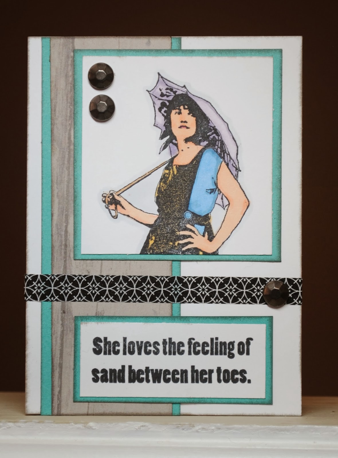
Sand Between Her Toes Card

Both the image and sentiment on this card are from Artistic Outpost's "Boardwalk" stamp set.  I colored the bathing beauty with Copic markers.  The B&T paper (Dakota) and Lagoon cs are both from CTMH.  The black strip of tape is from Recollections, and the embellishments are from CTMH.

Tuesday, March 26, 2013

Configurations Vacation Book

I thought I'd surprise my friend Teresa on her birthday with a scrapbook/shadow box from our road trip to the Gulf Coast last year.  Her birthday was a month ago, so it really is going to be a surprise.  Anyway, here's the end result:
Most everything is either from CTMH or Tim Holtz.  My basic idea came from the book Tim Holtz showed during the CHA show this winter.  The newspaper-like tape on all edges is Tim Holtz.  The papers are all CTMH:  mostly the "Surf's Up" paper pack with a little bit of "Dakota" (the worn boards paper).  All the stamps are CTMH.

This is a view of the inside of the box.  I like that it's a shadow box so you can add shells, matchbooks, and other 3D objects, but it still has a cover, so if we don't want to display it, it slides onto a book shelf nicely.
Here's what the Configurations Book looks like when you get it--naked.  You can move the boxes around in any order you want or remove some, but I liked the original pattern.  Next I covered the edges of every box with Tim Holtz tissue tape:
And all the other edges of the Configurations Book:
Next, I covered the flat surfaces with patterned paper.
Cut the paper just short of the length/width of the book, so the tape shows around the edges.  I also distressed all the edges of every piece of paper.  I added ribbon around the book for a bow closure.  I glued it under the paper on the cover and on top of the papers on the back and spine.
The back of the book with the ribbon on the outside.
The ribbon on the spine of the book.
I used different coordinating patterns for the backgrounds of the boxes.  I glued the three shells on their respective boxes with CTMH Liquid Glass.  There's also a matchbook and a bit of letterhead from hotel stationery.
Here are all the photos added.  I also included some CTMH embellishments from the Surf's Up pack.  The large box on the right is for a mini book.
I made sure the cover was flat, because I want it to fit on a bookcase without being damaged.  The pennants are a SU punch, but I used CTMH paper.  The baker's twine is glued behind the pennants, but they hang free at the ends.  The words & numbers are all CTMH stamps.
This is the little mini book inside the cover.  I made the "door handle" out of a square button and a bead, which I affixed with Liquid Glass.  I was careful that the door handle landed in the center of a box on the right side, so the book would still close.  I made the book with several pieces of cs, scored down the left side and stacked and glued down the left side.
I added pictures from each day of the trip on the inside, along with some coordinating stamping, and computer-printed journaling.  I couldn't help but add a picture of me & Tom with a note that we are some of the "most awesome friends ever."
I included pictures of some of the favorite food and drinks from the trip to give a complete feel of the vacation.  You can see the embellishments at the top of the inside cover, which fit inside a box to the right when the cover is closed.
 
I like to use white colored pencil to highlight stamping on darker papers.
 
 
 Here's the mini book on the right side.  Again, it's just a few pieces of cs scored and taped together along the top.  The embellishments and stamps are CTMH.
Two holes in the top of the book make it slip right over these hooks.  I can't remember their exact name, but they're Tim Holtz Ideaology pieces.
I didn't permanently secure the book, so it still slides off the hooks in case my friend wants to do some of her own journaling in here.
And the inside of this book.  Plain, but I thought I need to leave her some journaling areas too. 
 
 
(I can't get over Mark eating those raw oysters--Yuck!)
 
Here's some more pics of the finished project: 

I didn't glue down the individual boxes.  You could, but they stay in pretty well by themselves.
You can see in this photo that all my tape isn't sticking down perfectly.  That doesn't really bother me.  I like the look with the wrinkles and loose bits.  It could be remedied with some white glue or more careful taping technique, if the messier look isn't your style.
 
It did take some time, but this was a really fun project, and I plan to do more.