Welcome to My Blog!

Hi! Thanks for visiting! If you have a blog or other favorite website you'd like me to check out, let me know! And, please, comment on my posts--I'd like to hear from you.
--Ms. Molly


Wednesday, September 13, 2017

Ruby Rainbow Card

This anytime card is definitely not everyone's taste, because it's so busy, but I like the artsy feel of it. It will be for sale, along with many of my cards, in Colfax, Iowa, at Spring City Vintage. Whether or not shoppers looking for vintage items will be interested in this type of card is questionable, but I make what I feel like at the time, so we'll see.

 
I started out with a Dyan Reaveley style background:
 
I used her color-blocking style I learned at her workshop at Memory Bound in Ankeny, Iowa. I used Dylusions paints by Rangers in the colors of Black Marble, Crushed Grape, Vibrant Turquoise, and Fresh Lime. All the stencils were Dylusions as well. I also edged the paper in Black Marble.
 
Then I doodled over the background:
 
 
I mostly used a white pen, but I also used Dylusions Crushed Grape paint pen. The doodling was done purposely sloppy.
 
Then using the Ruby Rainbow stamps, also by Dylusions, I stamped out my images on to some old dictionary pages.
 
 
I colored the images partly with my Dylusions pens and partly with my Copic markers.
 
 
I cut the images out and glued them on my page. I went around the whole image with a wide black line to keep it from getting lost in the busy background.  I added "remember to take risks" with Tim Holt'z idea-ology Big Chat words, used my white marker to highlight the image and words, and then glued it to my card.
 
 
Here she is finished again. Thanks for checking out my blog!
Cheers,
Molly

Monday, September 11, 2017

Flying Heart Card

A Doodled and Painted Card


This card would work for a wedding, a baby, an engagement, Valentine's Day, etc. I left the inside blank so the sender can send it for whatever occasion they choose.

I started out by making a background using Dylusions paints and a Dylusions stencil. I believe the paint colors were Funky Fuchsia, Cherry Pie, and Pomegranate Seed. The stencil is a abstract brick design.  After the paint dried completely, I used a white pen to doodle a border. 


Then I cut a small piece of paper, rounded the corners and doodled a flying heart inside a frame, inspired by Joanne Sharpe's Doodle Art and Lettering book.  I water colored the heart doodle.
.
And that's it!  This card will be heading for sale at Spring City Vintage in Colfax, Iowa.


Saturday, September 9, 2017

Doodling!

My Latest Obsession . . . .

Do I need another hobby? another artwork obsession I don't have time for? something else to buy supplies to add to my stashes and stashes of supplies? Nope, not even a little bit, but I have one, and it's doodling. To be fair this hobby can leak over into my art journaling, bullet journaling, scrapbooking, cardmaking, and all my papercrafting, so I can justifying it that way.
 
I've always enjoyed doodling but didn't think I was very good at it. I got somewhat better after taking Dyan Reaveley's classes at Memorybound, my LSS in Ankeny, Iowa, last year. But a few weeks ago, I bought these two books:
Doodle Art and Lettering with Joanne Sharpe and The Art of Drawing Dangles by Olivia A. Kneibler
 
I think I got the Doodle Art book at Memorybound and the Dangle book at Michaels. They're both available on Amazon, but please try to support your LSS if it carries them.
 
(Warning side rant)Please do support your local scrapbook stores/local art stores, etc. I have to buy some supplies from the big box stores and online too, but when possible, I try to support local. I love the classes, examples of products, and attention you can only get from a local store. Most products they don't carry, they can order for me and no extra charge. And many LSS have frequent customer programs, coupons, and coupon matching that really make them price competitive. (End of Rant.)
 
Back to my doodling obsession: I've started trying to doodle something every day, whether it's in my dot journal or my sketchbook.
 
Here's some practice doodling:
I left the back of the page to the left in the photo on purpose. I use a very cheap sketchbook I picked up in the school supplies sale at Walgreens. Many of the pens bleed through to the back and even to the front of the next page, especially if you're filling in an image or going over a line multiple times. I only use every other page, and then I go through later when everything is dry and tear out the unusable sheets.  If this were fancy paper, I'd use the miscellaneous markings for some kind of art journaling, but this book was so cheap, there's no need.
 
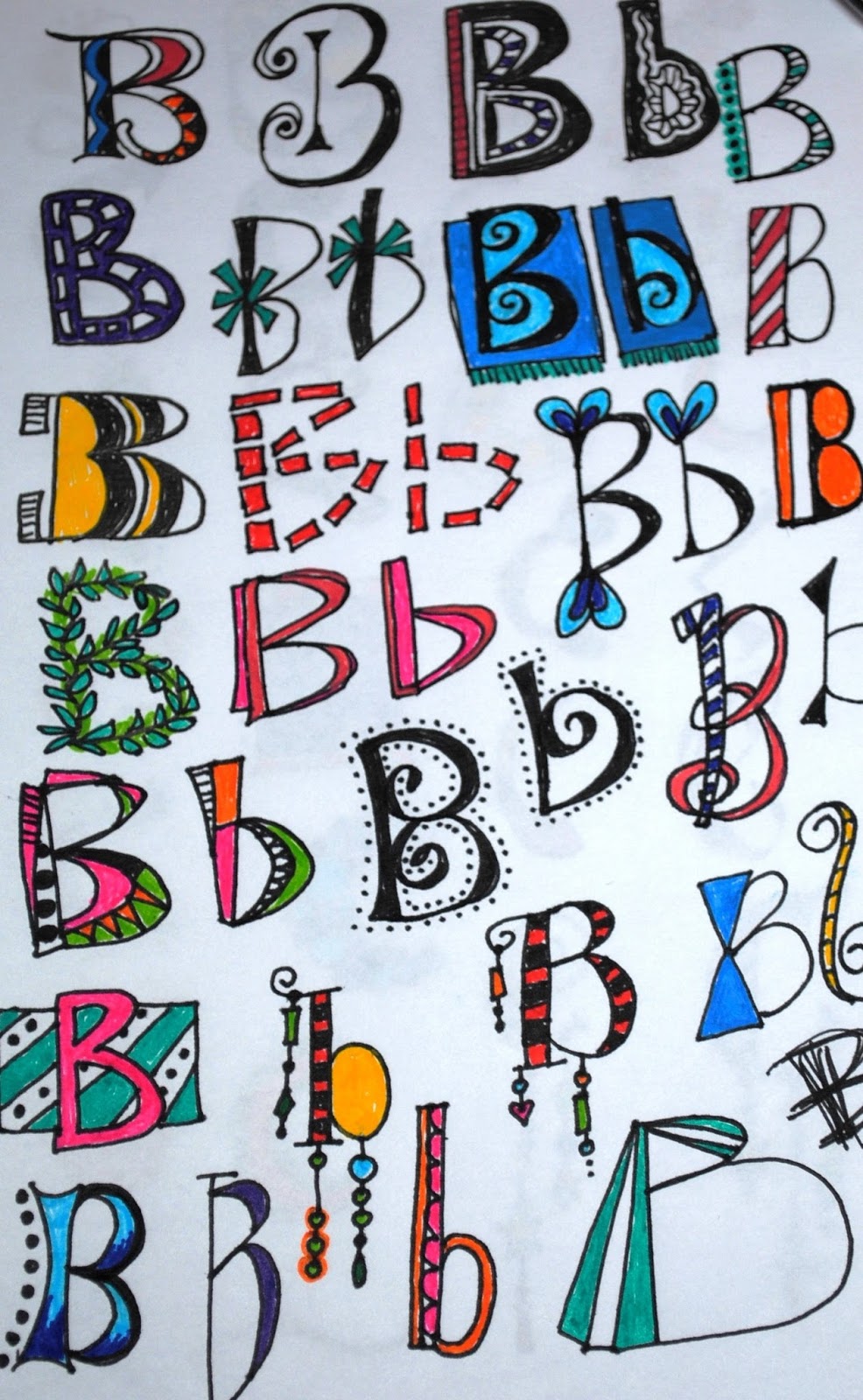
 One of the exercises I'm trying to complete is a page for each letter of the alphabet.  Here are examples. I'm up to the letter I.


Here's a line of dangles. I basically copied this straight from the book, so don't think I'm too creative.
 
 
And here are a couple pictures I made. Again, I got the main ideas/pictures from the doodling book, but I made some changes to make them my own.
  
 
This picture taught me how to make sand, which sounds easy, but I wasn't very good at it before this. I really like the way the sun turned out on this one too, and I'm also pleased with the red flowers in the tree. I don't know that you would see those red flowers at the beach, but who cares?
 
Another beach picture--all my favorites of anything always seem to be beach related.
 
I'm proud of how the waves turned out on this beach doodle.
 
Even before I started doodling, but especially now, I'm always asked what pens I use. The answer is I use all the pens and I want all the pens! But since I can't have all the pens, here are some I've been using for doodling.
 
Copic markers, Dylusions Paint Pens, Sharpies, Staedtler markers, uni-,ball, Faber-Castell, etc. I mostly use the Staedtler pens in my dot journal, but I have used them some in doodling.
 
Some of my favorites are the Ranger Dylusions line paint pens by Dyan Reaveley. The colors are bright, and I love how the paint flows from them. I have the colors and the black and white. Here they are up close:
 
And, of course, my other favorites are my collection of Copic markers. I use the Copic Sketch markers with the chisel tip on one end and the brush on the other. I store them incorrectly in an upright position in a utensil carrier. Because I only use the brush ends, I haven't had any trouble storing them this way, brush-side down.
 
 
I'll try to post more doodling pictures soon. 
As always, thank you so much for following my blog. Comments are welcome! (I do screen them to avoid spammers, so they won't appear on my blog right away.)

Thursday, September 7, 2017

Family Vacation Layout No, 4: The Arcade

Wisconsin Dells

This is the fourth in a series of layouts, to see the first three click on one of these links: Layout One; Layout Two; or Layout Three.


I don't know how many arcades our resort had, but we definitely hit all the big ones. Finn loved that he could play some of the games, and all the lights and machines were very exciting for him. And since we're all kids at heart, we all got into the spirit and played along too. Who doesn't enjoy skee ball or a good crane game where you win a ball the size of a beach ball?
 
Here's my layout for the arcade:

As you can tell, I wanted it to reflect the super busy, overstimulating atmosphere of the arcade.
Here's the left page up close:
 
 
The papers for these pages are all, I'm pretty sure, discontinued.  All from CTMH, they are from most recent to oldest, Adventure "Fundamentals," "Confetti Wishes," and "Hooligans." I was so happy to find a use for the old "Hooligans" paper that actually has a video game theme!
I stamped the title banner with one of my all-time favorite alphabets: CTMH's "Pennant Alphabet." It wasn't shiny enough alone, so I added Ranger's Glossy Accents.
 
 The embellishments are an assortment of CTMH and other stuff from my stash, none of it new. This was a great layout to use up some old items. Here's a close-up of some of them, along with that "Hooligan" video game paper. The little white words on black backgrounds are from Tim Holtz's Ideology collection "Big Chat."--probably the only current product on the layout!
 
 
Here's a closer look at the right layout.
 
 
It's more busy-ness in paper and embellishments. The "Be Happy love life" are cut from a B&T paper in the Fundamentals "Adventure" pack. 
 
 
 You can kind of see in this close-up that I used Rangers Glossy Accents again over the letters to give them a shine. And here's a last look at the whole layout:


A great vacation! I can't believe I've already finished the scrapbook pages for it. That's definitely something I haven't been very good at keeping up on in the last several years.
 
 I'm ready for another one! Next up, the Parrotheads go to Pensacola for a long weekend, and I'm ready! Will it get scrapbooked in a timely manner? Probably not, but It's good t have goals. 


Tuesday, September 5, 2017

Family Vacation Layout No. 3

Wisconsin Dells

This is the third in a series of layouts, to see the first two click on one of these links: Layout One or  Layout Two.


The Dells are all about waterparks. Our resort alone had something like three outdoor waterparks and three indoor waterparks, including huge slides, wave pools, and anything else you can think of. 
We spent much of our time in the kiddie areas with the grandkids.  Here's the layout memorializing those times:


I really like this two-page spread. The papers are from CTMH's "No Worries"
Workshops Your Way. The pink and yellow cs are also CTMH. The left page is devoted to Shae, our water baby, and the second to Finn the wild child.

 
On Shae's side, I matched the cs with the pink in her super-cute sun wear. She hadn't been sitting up alone for long, and it was adorable seeing her sit up by herself in a couple inches of water.
The "Brave & Strong" sticker was from the CTMH "Jack" Workshops Your Way stickers.
The button on the top is from Dear Lizzy.  I added doodling around the striped piece and silver Stickles dots to match the title.  Here's a close-up:
 
 
When I start to run out of a set of letters, I like to mix them together, and that came together well here. The letters were from three old sets. The net is from a CTMH stamp, and I doodled the white splashes with a white pen.


Finn's side used yellow cs to match the waterslide and the yellow in his trunks. He had an absolute ball going doing the slides and playing in the water.  The title letters are from the "Jack" CTMH Workshops Your Way.


"Together under the Sun" is from CTMH's "No Worries."  I used up a bunch of aqua Dots from CTMH around the sticker and at the top right to resemble water. Again, I doodled the splash above the title to make it coordinate with the other page.


The bright, fun look of this simple two-page layout really captures the joy the kids had in the water. The two pages use a lot of different colors and elements, but they have enough like components that they really compliment each other. Here's a look at the whole layout again:


Sunday, September 3, 2017

Family Vacation Layout No. 2

Wisconsin Dells


This is the second in a series of layouts, to see the first layout, click here: Layout One 


This second layout from our Dells vacation is about where we stayed, The Wilderness Resort. Like the first layout, I used papers and embellishments from the CTMH "Jack" workshop on the go.
 
Here's a close up of the first page:
 
 
I doodled the title. I'm super into doodling lately, and you'll see it in a lot of my projects going forward.  The bears were lighter in color than I wanted, so I used a Copic marker to darken them both. You can also see I doodled around the bears and tree & star stickers, and added some extra lines, dots, and scribbles.  The small typewriter-like sayings are from Tim Holtz's idea-ology collection called "Small Talk."
I feel bad Shae's beautiful face has a glare on it, so here's a close up of her--so cute.
 
Second Page:
I used some more sticker embellishments from "Jack" and added more doodling. Again, I darkened some of the stickers with my Copic marker. Whenever something is messy or we argue, or just to be stupid, we refer to our family as the Gallaghers (from the Showtime show "Shameless"), so that's why it says that.
 
Thanks for looking! More layouts soon!


Friday, September 1, 2017

Family Vacation Layout

Wisconsin Dells

I actually finished the layouts for our family vacation to the Wisconsin Dells. This is the second year in a row we've driven to the Dells, and I think last year's trip has maybe one layout done, so don't be too impressed.  My last post was also a Wisconsin Dells vacation page, but it was solely for Shae's baby book because it was her first vacation. (Poor Shae--her baby book is so empty. That's also on my to-do list: more layouts for Shae's book.)

Here's the first layout for the trip. I like to start like sections of layouts with a one-page layout, kind of a title page for either the whole scrapbook if it's a large number of layouts or if it's a section of layouts within a book of various layouts, then it signals the beginning of a new section.

 
The Dells is approximately 5 hours away from where we live in Iowa, so we road trip there. I know not everyone does, but I love a road trip. We always have some great laughs and memories from the road. The top left photo is a selfie of us in our rented minivan. Shae isn't visible because she's in a rear-facing car seat in the way back. The other pics are Shae in her "Vacay All Day" shirt and Finn in his vacation shirt that we bought him in Hawaii last year. His quote (on the page) cracks me up: "This is my vacation shirt. It's really orange."
 
Everything but the title is from CTMH's "|Jack" workshop on the go. It includes coordinated papers and embellishments.  The title is a die cut I picked up at my LSS, Memory Bound in Ankeny, Iowa.  I wrote the dates of the vacation with a white uni-ball pen.