Welcome to My Blog!

Hi! Thanks for visiting! If you have a blog or other favorite website you'd like me to check out, let me know! And, please, comment on my posts--I'd like to hear from you.
--Ms. Molly


Sunday, May 31, 2015

Wendy Vecchi Class

Several weeks ago I was fortunate to attend an art class by artist Wendy Vecchi in Moline, Illinois.

First, we learned a bunch of ink and embossing techniques using tags:

Art is a messy business.

Here's a pic of me with Wendy. She is super nice and soooo talented!


Her husband was there helping, and he had packed some of her supplies in this "Bud Heavy" box. Lol.

After lunch we started on our framed canvas project using our newly acquired skills. 


Here's my finished project. I ventured off the project a little, but I can't help myself. I love the finished piece.


Saturday, May 30, 2015

Everything Is Better with a Friend Birthday Card

I pretty much love everything about this card, if I do say so myself. I even like the photograph. And, everything IS better with a friend.
 

Again, I was thrifty and used scrap paper! The stamp is from the Girlfriends line by Art Impressions titled "Laughing." The sentiment is from CTMH's "Better with a Friend" stamp set.
Both the image and sentiment are matted in black cs, and I used a miscellaneous flower and some bling from my stash.
 
I used Copics to color the ladies and the open areas in the word "friend."
One thing I like to do when coloring with Copics, which was probably taught to me at my first Copic class, is to outline everything in light grey. I use C1 Cool Grey. It gives the image a little depth. Also, the pool of grey color around their feet grounds them so they aren't hanging in the air.

Friday, May 29, 2015

Wavy Blooms Birthday Card

I like the way this card turned out. It's another made from scrap paper I had on hand. The flower is from CTMH's "Wavy Blooms" stamp set, and the sentiment is from CTMH's "Joyful Birthday" set. The white paper was stamped with a wooden background stamp with yellow polka-dots in CTMH's Canary ink. I colored the flower and leaf with Copics, used clear and orange Stickles on the flower, and attached the piece with dimensional adhesive.
The inside of the card says ""Do What Makes You Happy" also from the "Wavy Blooms" stamp set.

Thursday, May 28, 2015

Key West Layouts (post 3)

Parrotheads:

 
I used an 8x10 photo for this layout from our Key West trip. It shows the whole gang who went, aka our Parrothead (fans of Jimmy Buffett and everything beach) friends.
 

I used CTMH's Hopscotch paper pack for the background with mats of CTMH's Smoothie and Champagne cs. "Parrotheads" is stamped with CTMH discontinued stamp set Posterboard, which is probably my all-time favorite for layout titles. I stamped directly on a B&T paper from the Hopscotch pack, so the letters are patterned, but the thick outlines of the letters are easy to cut out. I added a few miscellaneous flowers and embellishments and some words of coordinating zip strips.
This layout makes me smile. It was a great long weekend with some of my best friends, and lots of memories were made--all good, some funny, and some hilarious.

Wednesday, May 27, 2015

Key West Layouts (post 2)

The Best Wave of Your Life Is Still Out There:
 
 
This was one of the quickest and easiest layouts I've done in awhile. I started with one of those cheap background papers from the 1990s. I wish I would have taken a picture of it "before."
It looked like this one, except no palm tree and had the hibiscus in the corner:
Remember these? I think it came with an old vacation kit, complete with cheap album. Anyway, I'm all about using up my stash lately since I've reorganized my studio, so I used it just for the bamboo outline and flower.
 
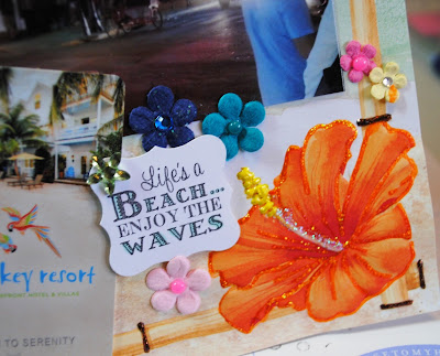
I added the pictures (no mats) and clusters that included beach sayings, flowers, bling, and our resort key.
 
 
The sayings are all on different-sized punches and are affixed with dimensional adhesive. After everything was on, I went over the hibiscus and all the bamboo joints with sparkly Stickles. It really changed the page. Here's the final layout again:
 
It is my last layout of the trip and includes photos from four different spots on Key West. The border and all the flowers tie them all together. Incidentally, that drink on the lower left? It was AWFUL--too thick and creamy for a hot day. But, the straw was fun, and it was definitely picture-worthy.
 
More Key West layouts coming....

Tuesday, May 26, 2015

Key West Scrapbooking

Tom & Molly in Key West:
 
This is one of those layouts that looks so much better in person, that I almost didn't post it. Picture the black dots a little muted and everything looking, well, just better.
 
We went to Key West in December with ten of our best friends, and I'm almost done with ALL the pages. I'll post them all one by one. This one is probably the best pic of Tom and me during the trip. It's not at the beach, but it does overlook water and looks tropical.
 
 
I saw a mini book where someone had used light blue and black for beach pictures and loved it. Little did I know it wouldn't photograph well for me. :( 
 
I started out by making my own background paper with white cs:
 
Then I selected all the papers I wanted to use. I used scraps for everything! It really made me feel very resourceful.
Everything was blue-tinted, with a little bit of peachy pink to match my shirt. (More photo issues: the paper that looks green and grey is actually a very beachy blue and light green.)
 
Then I started cutting paper. I knew the general layout I would use. I've used it before, and I think it's common enough I don't need to give credit to anyone for the pattern. I see the horizontal strips with thinner vertical strips a lot. I don't spend a lot of time measuring. I just eye it and cut.
I tore the edge of the biggest piece for a beachy/casual feel. Most of the paper is distressed with black ink (hard to see) and I matted the photo and the paper directly under it in white for definition.
 
I used dimensional adhesive on the photo then gathered up all my mismatched embellishments that matched either in color and theme. CTMH users will recognize some very old embellishments. I even added a rub-on heart and an old acrylic tag.
 
Here's the finished piece again:
In person, it came out great! I go back and forth with the scrapbooking style of one photo per page or multiple photos. One per page is more artsy, but when you have a lot of pictures, it's just too many pages to do, so I save it for photos I really like.
 
More Key West layouts to follow....

Monday, May 25, 2015

Colorful Graduation Cards

(Second post today. Please scroll down to see my first post.)
 
Tired of all the black & white graduation cards? Me too. Why always use black and white with maybe some silver or gold unless we know the graduate's school colors?--and even then we just add red, blue, or some other basic color.
 
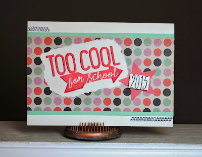
I made these nontraditional graduations colorful. I also used scraps of paper in my scrap stash. All weekend I'm trying to use up scraps.  On this first card I used CTMH's stamp set "Chalk It Up":
I used a black Sharpie to highlight the letters and arrow and popped up the 2015 with dimensional adhesive. I really like the retro colors of this paper. 
 
And this card's letters were cut from CTMH's Art Philosophy Cricut cartridge. Again, I used scrap paper.
This card is not my own design. I saw something very similar on Pinterest, but the link led me to a Better Homes & Gardens website. I apologize for not being able to name the original designer.

Metal Deck Ornament

I've had this metal deck ornament/mobile for years. I liked it a lot when I bought it, but it probably should have been thrown out years ago because the paint was so worn and faded:
 
I'm so glad I didn't throw it out! A month or so ago I went to an all-day class with Ranger designer Wendy Vecchi. One of the things I learned is that her archival ink coupled with her embossing powders work on metal. You can change the color of anything metal--permanently!
 
First I cleaned the pieces up. Here's what they looked like--pretty bad:
 
 Next apply the archival ink.  I used Buttercup for the sun and star and Cornflower Blue for the crescent moon.
 
After the whole piece is inked (you might not be able to see the color--especially a light color like I used), apply the embossing powder. I didn't take a picture of this step, but it's just like embossing on paper. Apply a generous amount of embossing powder on the wet ink. Use a piece of clean paper underneath your project so you can keep and reuse the powder that doesn't stick.
 
Then melt the embossing powder with a heat gun (not a hair dryer!). You might have to do these steps more than once. You can see a few areas I had to do a second time.  Also, be careful when heating the metal--it gets HOT in your hand!
 
Here's a side-by side look at the difference (courtesy of my phone's photo collage app): 
 
And a picture of all the pieces completed. It's quite a difference!
It's hard to see except on the moon, but I also added some highlights on each piece with Ranger's gold embossing paste. I just applied it with my finger and gave it another shot with the heat gun to set it.
 
And one last shot of the ornament re-hung on the deck after being spray sealed for outdoor use. Much better, right?
 
Nothing metal inside or outside my house is safe! I'm going to be re-coloring everything metal. 
 

Sunday, May 10, 2015

Happy Mother's Day!!!

Happy Mother's Day!!!
(A four-generation picture: me (with hair blowing terribly), my daughter Jess holding my grandson Finn, and my mother Violet)

Thursday, May 7, 2015

Spring City Vintage Mother's Day Cards

Some more Mother's Day cards for sale this weekend at Spring City Vintage in Colfax. The outer two cards have rose images from vintage postcards. The center card is made with a sprayed background with daffodils stamped in the foreground.

Wednesday, May 6, 2015

Can't Get Enough of Florida!

Two weeks ago we went back to Florida for the weekend, this time to the Treasure Island area. I'm telling you, this Iowa girl cannot get enough of the beach! Look at this view from our room and tell me how I possibly wouldn't want to go back.  More beach photos to scrapbook!

Tuesday, May 5, 2015

Mother's Day Cards


Some quick Mother's Day cards I put together for Spring City Vintage.

The candy jar on the far right and its sentiment is an image from CTMH's stamp set Sweet as Sugar, which is a hostess reward set.  The dog & cat stamps are from CTMH's Friendly Pets stamp set. The sentiments on those cards are from CTMH's Just to Say... stamp set.  I colored all the images with Copics. The hearts on both of the cards are popped up with dimensional adhesive. It's hard to see in the pic, but the candy dish has clear Stickles on it. The dog's & cat's eyes are tiny black CTMH sparkles. All the B&T papers are from my stash of scraps.

Monday, May 4, 2015

Crafty Organizer

This project was a craft project and an organizational project. Like the cover says, "It's a good day to have a good day," and I hope this little organizer helps me do just that.
I'm always going to the craft store and then buying things I don't need--ok, I really, truly need it ALL--or else buying itmes I already have. so I decorated this pocket organizer to use for lists of craft supplies, both for supplies I want to buy and for items I already have.
 
Here's a look at the inside.
Each page has a pocket for notes.  I decorated the whole book very simply, using images from Graphic 45's Typography paper pack for all the inside pockets.
 
Some of the pockets I titled for specific product lines. Although I accidentally cropped out the title, this pocket stores my chart of Copic markers I currently own. I also have pockets for Tim Holtz products, Wendy Vecchi products, craft sprays, etc.
 
I decorated the cover with more Graphic 45 images and some miscellaneous accessories I had.  This picture shows some of the dimension on the cover. To make the book close flat, I only added flat images inside the book.
 
With this book, my artsy side of my life is SURE to stay organized (fingers crossed).